Role
Sr. User Experience Designer
Tools
Figma • Adobe XD
Deliverables
UI Library • Documentation • Templates
Project overview
I joined this project from it’s kickoff, with the goal of creating a design system that main objective was to address all the accessibility and usability issues across Microsoft sites. As a senior designer I was paired with other Designers, Engineers, Accessibility Specialists and Business Directors.
I worked on the creation of reusable components, guided by clear standards, that can be assembled together to build any number of web experiences. Also addressed the intent for them go hand in hand with the need for scalability, efficiency, and consistency in design. I helped with the creation of the Moray Design System providing not just user design expertise but also strategy for implementation and content guidance. In this project you will see some of the styles, components and patterns that I built for this design system.
Execution
Foundation
Grid & Breakpoints
With its rigorous hierarchies and geometry, the grid orients us. The base grid is 12 single columns. Each column can have a set percentage width or fraction of the standard 12 columns (col-3 is 3/12, or 25%) or can flex to equal-sized columns within a row to support five and eight column layouts.
Breakpoints are mostly based on minimum viewport widths and allow elements to scale up as the viewport changes. The system needs at least 5 breakpoints to account for a handful of experiences all the way from extra small device to extra large devices.
Typography
Following Microsoft brand guidelines, the font for this design system has to be Segoe UI. For the design system I wanted to provide five type ramps and two font weights to optimize the user experience on a wide range of devices. Also, created/calculated type size and scaling based on an interoperation of Fibonacci sequence to allow the type to scale responsively based on breakpoint widths.
Color Palette
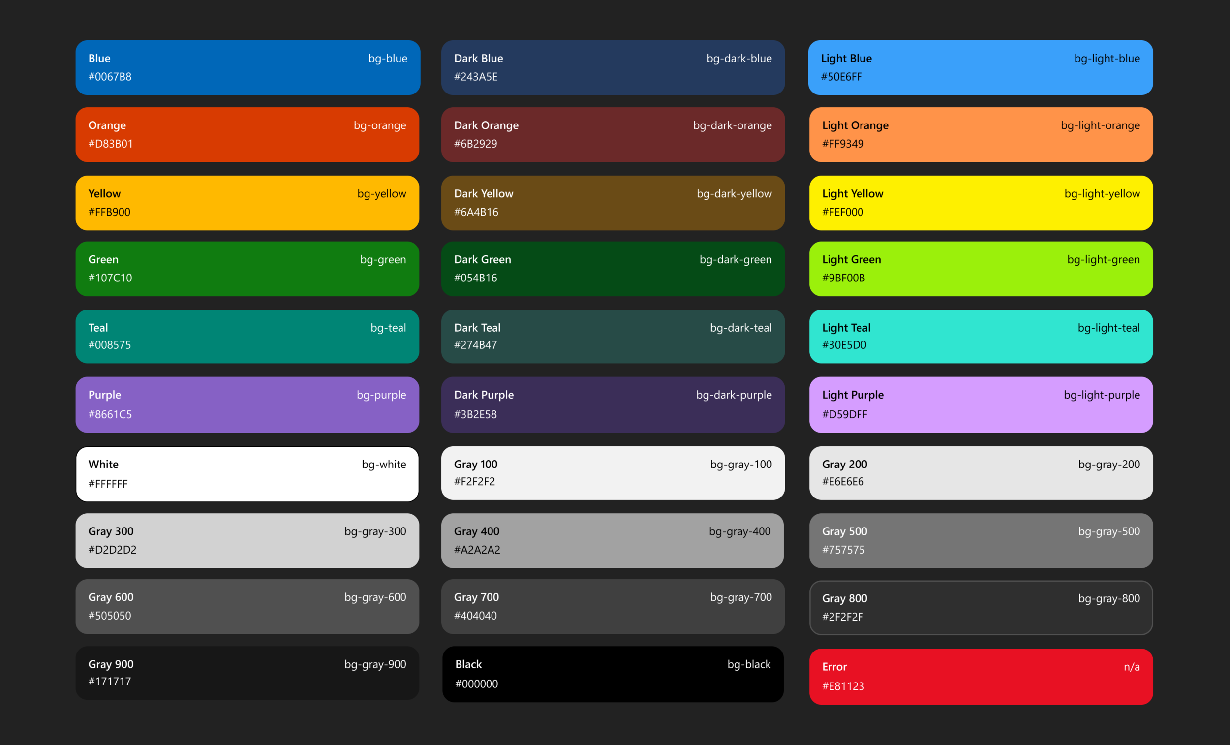
This curated palette reflect the Microsoft brand. I made sure all colors were optimized accessibly when used and paired appropriately.
Design
Naming
When building components, it is important to think about a naming & convention from the start. This will not only make it much easier to pick the right symbol in Figma but also help designers to search when adopting the library.
Components
Components are the building blocks and are single, stand-alone pieces that help build functionality into web experiences. I designed multiple components like buttons, carousel controls, drop-downs, radio buttons and tabs to name a few. I created each state and possible variations and ensure each met accessibility requirements. You can see a few examples below
Buttons
Radios
Tabs
Patterns
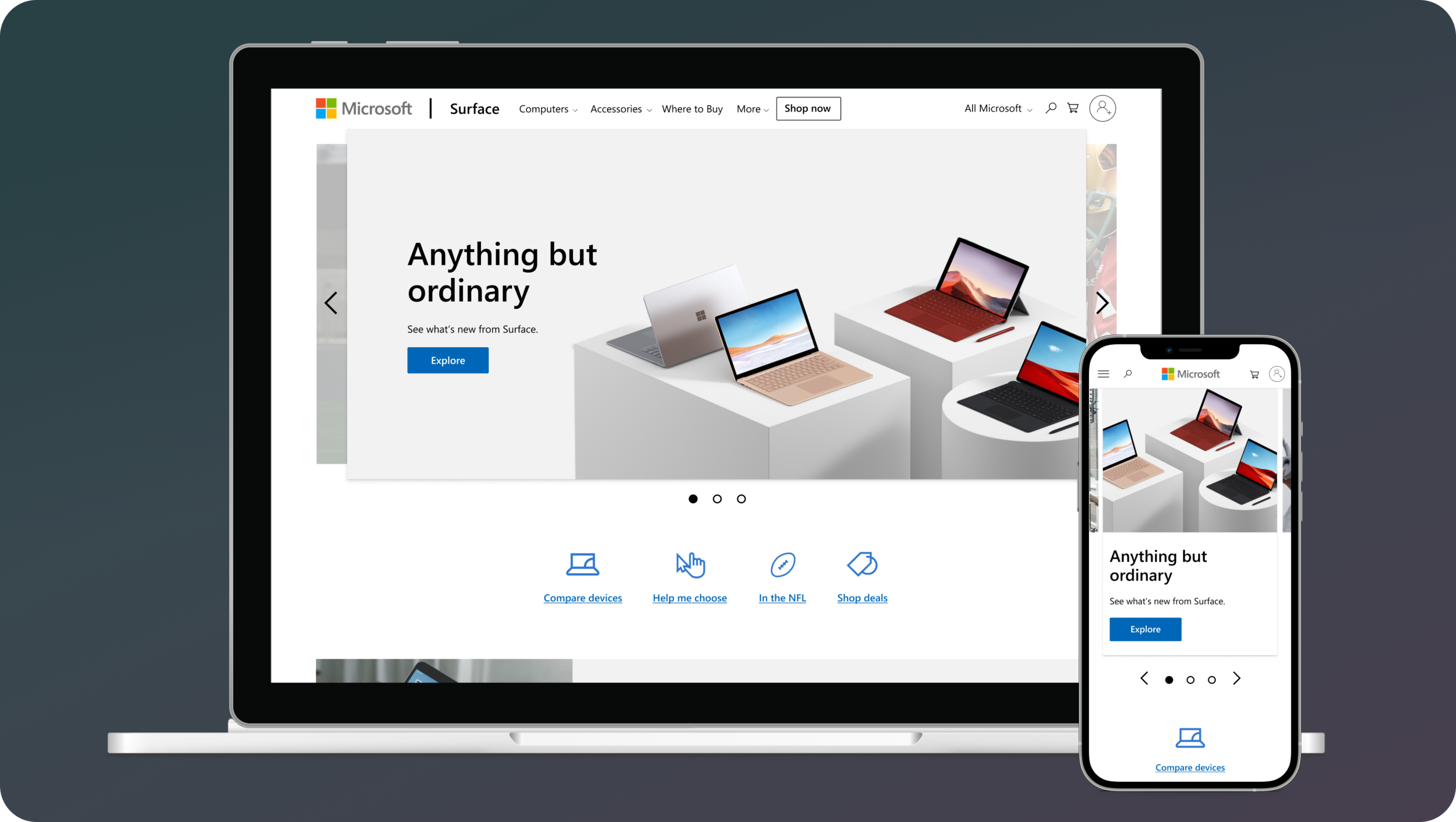
Built using components, Patterns are repeatable parts of the Web Framework. Enabling greater functionality with pre-defined guidelines and use cases where the design makes sense for the stakeholders, testers and users. These will be used to produce screens with actual content. I designed some of the most common used patterns across Microsoft, some of these include: Hero, Mosaics, Feature and Content cards.
Highlight
Mosaic
These designs have some complex approaches like designing for each viewport and making sure it’s completely responsive. I created multiple variations to account for all use case scenarios, did intensive amount of pressure testings to accommodate localization, making sure everything is completely accessible and finally created detailed documentation and recommendations of the use of each pattern.
Examples
Built using both Components and Patterns, examples are pre-built pages that can be used to create larger parts of a page or used as templates. Specific examples generally contain guidance and recommendations. I designed some complex examples like, Device configurator box, Wish List and Page templates.
Documentation
Guidelines
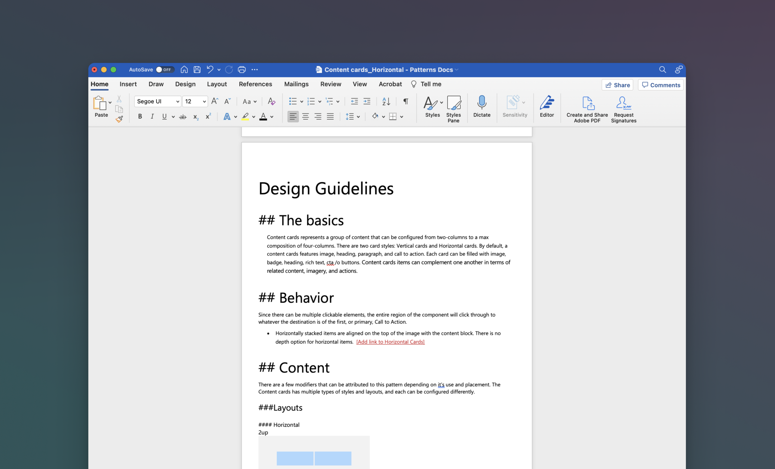
Partnered with a UX writer, helped to write detailed documentation and guidance for components and patterns of the design system. Making sure content followed the same structure and language, this drove to the creation of a documentation template.
Documentation site
Partnered with web-developers and accessibility experts created a shared space for the Microsoft community to support and showcase all type of guidelines and resources that guide adopters on how to use the design system.
Outcome
• Visual language
Leverage industry score cards and research to improve the system with global UX standards.
• UI Library
Consistent catalog to enable experiences across Microsoft web with cohesion across the user journey to build trust with end users.
• Accessibility
Web experiences for everyone with the creation of an inclusive design system that includes experiences for user of all audiences, geographical locations and user abilities.
• Adaptation & Collaboration
A system that constantly evolves from shared learnings from adopters.


